
As we established in our blog post last week, color psychology is so important to interior designers and something that designers and homeowners should be aware of. Before you continue reading, go review our previous blog post on Color Theory which focuses on primary colors. Today we will move on to the secondary colors Orange, Green, and Purple.
WHAT’S THE DIFFERENCE BETWEEN PRIMARY AND SECONDARY COLORS?
This all stems back to the color wheel which was invented by Isaac Newton back in 1666. You probably studied this in elementary school, but here is a review: Primary Colors – Red, Yellow, and Blue – are the basic colors of the color wheel. Primary colors cannot be made by mixing other colors together, but by mixing primary colors you can make all of the other colors in the color wheel.
Secondary Colors—Orange, Green, and Purple – are colors that were made by mixing two of the primary colors together.
Red + Yellow = Orange
Yellow + Blue = Green
Blue + Red = Purple
There is actually another set of colors on the color wheel called Tertiary colors that are made by mixing a primary and a secondary color together. We won’t get into Tertiary colors when talking about psychology; otherwise, this article would go on forever!
PSYCHOLOGY OF SECONDARY COLORS
In general, secondary colors seem to have a less extreme effect on people’s psyches. They also tend to be a bit more versatile as they take on characteristics from both of the primary colors that were mixed to make them.
Orange
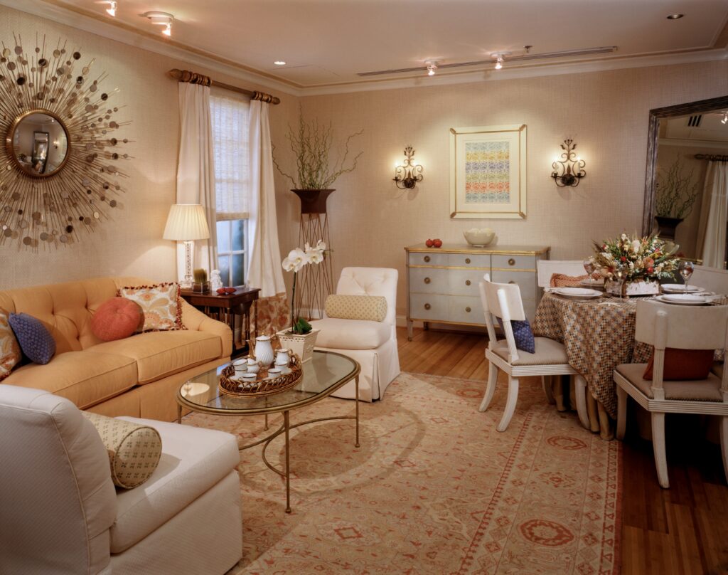
Orange is a bold color that has a mostly positive effect on people’s moods. Orange is a perfect mix of red’s energy and yellow’s happiness creating an energetic and cheerful color. Psychologically, orange is the color that best kindles creativity and helps with decision-making. It also is seen to improve socialization and confidence.
We tend not to use the color orange very often, but there are definitely some beautiful oranges out there. Orange accents could be stunning in a living room or, if you need a creativity boost, perhaps add some sunset tones in your office!
- Warm
- Cheerful
- Creativity
- Energy
- Hunger
- Socialization
- Confidence
- Decision-Making
- Sunshine
Green
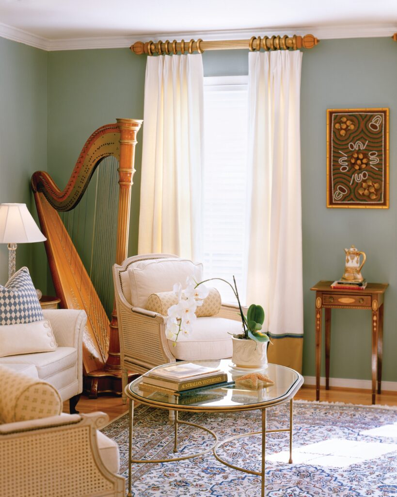
Green is a well-loved color in interior design and it’s especially popular right now. It is actually considered to be the most relaxing and restful color to use in interiors. Green is, of course, associated with nature and is a symbol of calmness, growth, freshness, and stability.
It is extremely versatile as it is a blend between warm-tone yellow and cool-tone blue and can take on characteristics of both. For example, a lime green color which has more yellow is more energizing, whereas a bluer green like pine or viridian can have more of a calming effect.
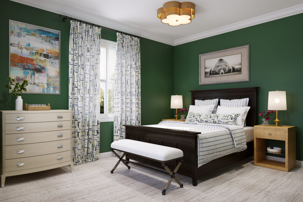
We think green is such a great color that you can use throughout the house. Green kitchens have been all the rage recently, but we also love using nice calming greens in bedrooms and bathrooms. If you aren’t feeling green- you can always add in some nature using greenery!
- Mix of Cool and Warm
- Calm
- Nature
- Growth
- Peace
- Freshness
- Stability
- Envy
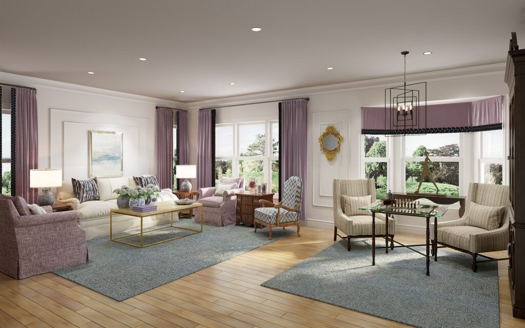
Purple
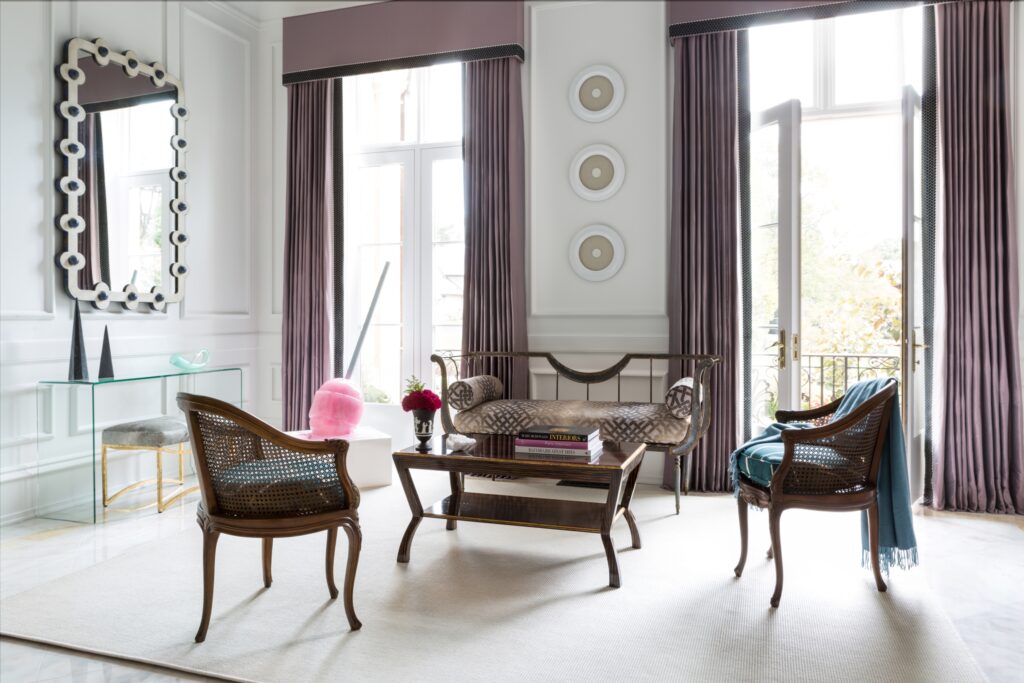
Like Green, Purple is a mixture of cool and warm tones. The mixture of bold red and tranquil blue creates a color that symbolizes elegance, drama, and sophistication. Purple is actually the color of royalty and gives a regal touch to every space. The lighter and cooler-toned purples are known to be calming and relaxing whereas the darker and redder-toned purples take on more characteristics of red and create dramatic, moody, and sometimes mysterious environments. Another feature of purple is that inspires creativity.
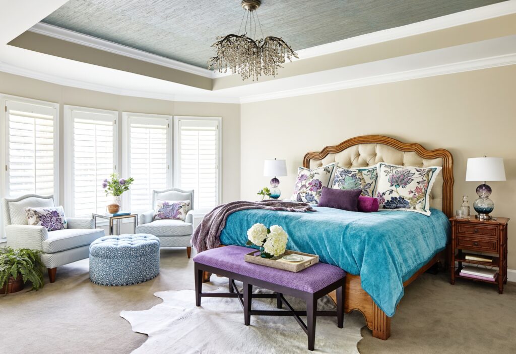
We love using a wide range of purple tones in our designs! It adds so much elegance and drama to a space. Purple is a great color for your formal living room but can definitely be used elsewhere in your home. Eggplant is one of those colors that we are expecting to gain popularity this year.
- Mix of Cool and Warm
- Elegance
- Sophistication
- Royalty
- Creativity
- Mystery
- Drama
- Calm
What are your favorite colors to use in your home?
Stay tuned for next week’s blog where we’ll dive into whites and how undertones affect our psyche.
Stay Inspired,
Margery Wedderburn Interiors
