
Did you know that the colors you use in your space can affect your mood and influence your emotions? Keep reading to learn more about how to use colors that best suit your needs.
WHAT IS COLOR PSYCHOLOGY AND WHY DOES IT MATTER?
Color Psychology is an aspect of Color Theory which has been studied for hundreds of years. Color can affect things like mood, productivity, and even creativity! Every color has a different meaning and there is even a psychological difference between warm and cool-toned hues, which is why it is so important to know these things as a designer (and a homeowner).
Color Psychology is essential when designing interiors because as designers, our number one goal is always to make a space functional and comfortable for our clients (as well as being beautiful of course!). Colors can mean different things to different people, so it is very important to figure out what you like the best.
PSYCHOLOGY OF PRIMARY COLORS
There are so many elements of a color that affects us. Vibrant colors tend to be energizing while muted tones are more calming and serene. Undertones are also a big factor – Warm tones are cozy and inviting whereas cool tones are seen as being calm and refreshing. Another aspect of color theory is cultural significance – a color can mean something completely different to your client than it does to you, so make sure you know their preferences!
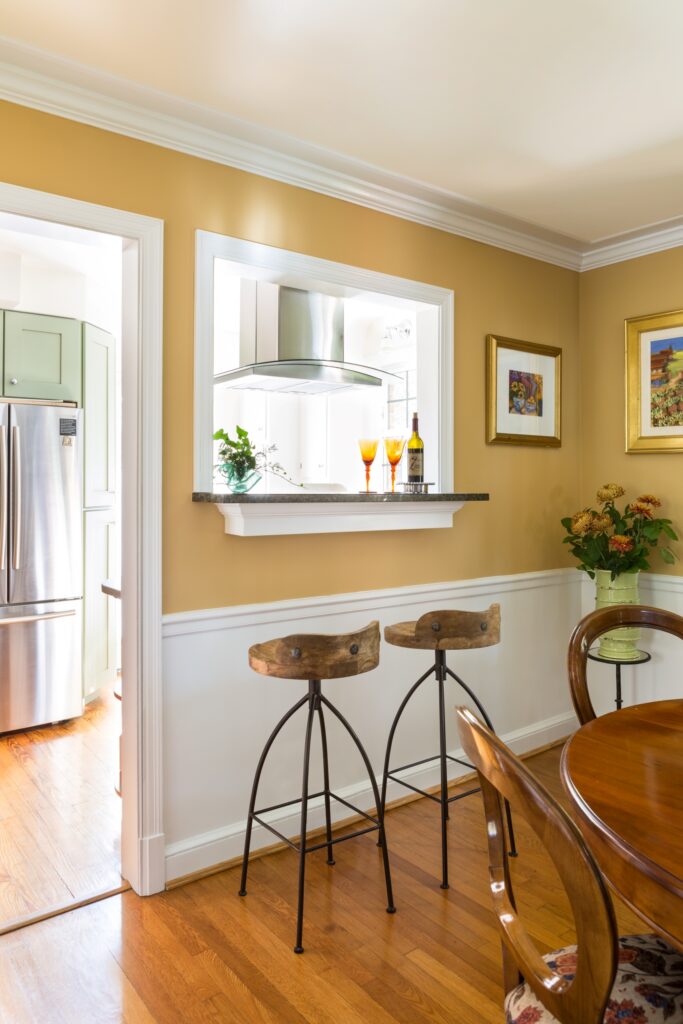
Red
Red is a very powerful and vibrant color that evokes a wide range of emotions – everything from life and joy to danger and anger. In Chinese culture, red means luck, life, and light. Wedding dresses in China are often red because it is such a great symbol of joy. On the other hand, some people see red and immediately think of danger or anger which leaves them feeling uneasy.
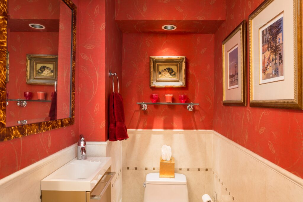
Red is also an energizing color, so it is great to use in your more active spaces where you need an energy boost! A crazy thing about red is that it actually makes you hungry, which is one of the reasons why so many fast-food restaurants use this color in their marketing.
We love to use red in our accents as it always adds a beautiful pop of color. It can also be used as a paint color but due to its boldness, some people can find it overpowering and even stressful, especially in small spaces.
- Warm
- Power
- Energy
- Luck
- Life
- Joy
- Danger
- Anger
- Aggression
- Stress-Inducing
- Hunger
Yellow
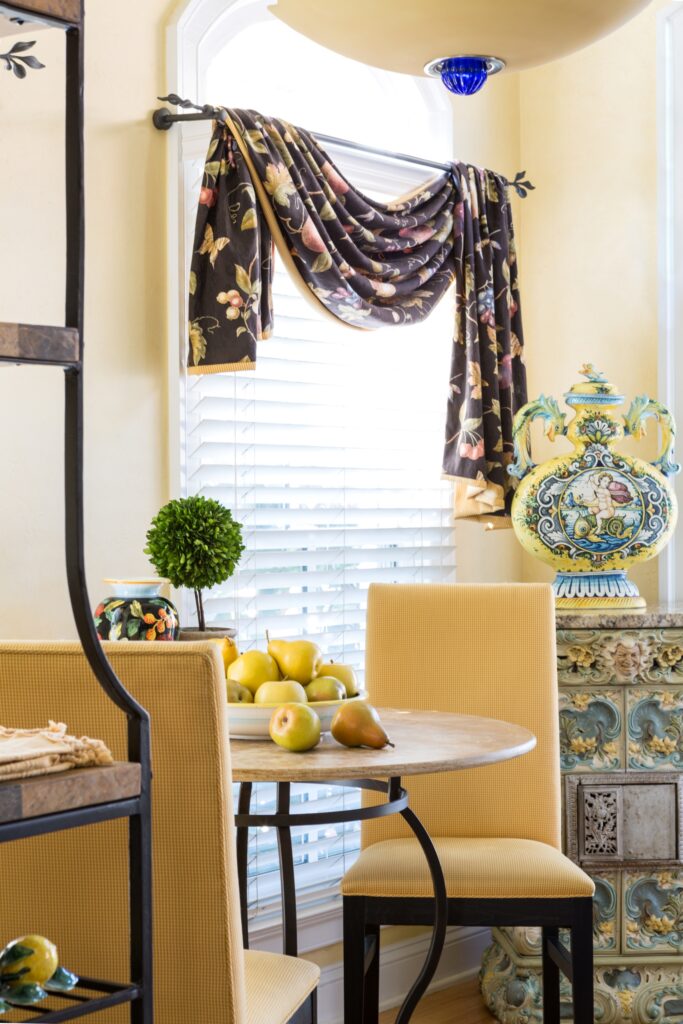
Yellow- the sunniest of colors! Of course, one of the main emotions connected to yellow is happiness, but it is also the color of optimism, harmony, and intelligence. It is a great mood-boosting color, but you have to be careful of the shade you choose and the quantity you use. Dark and dull yellows are associated with sickness and impending doom- perhaps not the best choice if you are wanting to liven up your space. On the other hand, too much of bright yellows can be irritating and actually drive up a person’s blood pressure! If you really love bright yellow, we recommend using it sparingly, or in spaces that are used more infrequently.
Before gray walls were the rage, we used to design some homes using yellow walls and we love how it brightened up the space. A breakfast nook is a great place to add this bright color. We also loved to use light, muted yellows in living rooms and entryways as it felt welcoming and energizing without being too “in your face”. These days, the various color ranges of white tones are the way to go on your walls and ceilings.
Fun Fact: Did you know yellow is the oldest color? It dates back to the ochre pigment used by Ancient Egyptians.
- Warm
- Happiness
- Optimism
- Light
- Life
- Sunshine
- Intelligence
- Harmony
- Sickness
- Doom
- Irritation
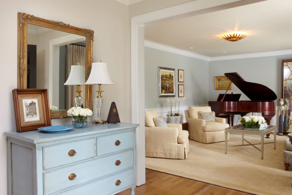
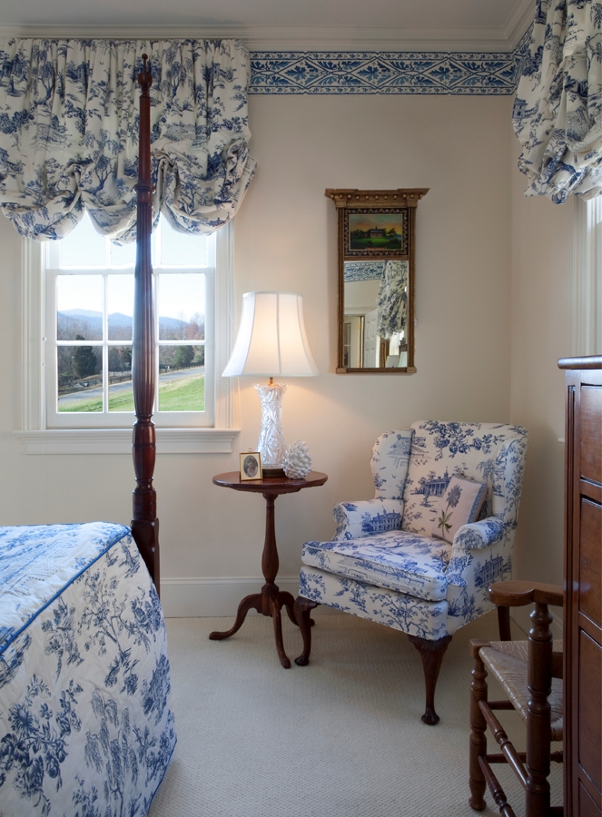
Blue
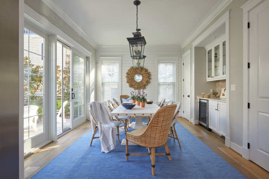
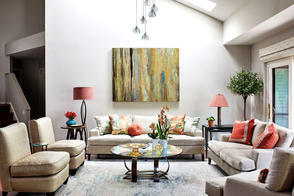
Blue is one of the most calming of all the colors to use in interiors. It actually relaxes your mind and slows down your heart rate, blood pressure, and even metabolism. Blue creates a soothing and peaceful space which is why it is the top color choice for bedrooms and a top pick for all interior spaces in general. In addition to the color’s soothing nature, it is also a symbol of intelligence and trust. Royal and Navy blue is often associated with elegance as well. One thing you do need to watch out for with blue is that you don’t want to pick a sad sleepy blue that will bring down your mood. Some blues just suck out all your energy!
Blue is probably the color we use the most in our interiors (other than neutrals and whites of course). Blue is just one of those colors that can be used anywhere!
- Cool
- Nature
- Calming
- Healing
- Trust
- Wisdom
- Peace
- Elegance
- Sadness
What is your favorite color that we talked about today? Do you agree with these color characteristics?
Stay tuned for next week’s blog where we talk about the psychology behind secondary colors.
Stay Inspired!
The Margery Wedderburn Interiors Team
