It’s time to talk about white, the most commonly used color for interior spaces due to its versatility. We will also discuss the importance of undertones in this article, which is such an important element when creating a space that fits you and your needs. Before you keep reading, make sure to read our previous articles about Color Psychology Part I and Part II.
ALL ABOUT UNDERTONES
On the color wheel, you have colors that are either warm or cool. They are labeled as such based on what feelings we get when we look at them. Warm colors – Red, Orange, and Yellow – remind us of fire and the sun and make us feel cozy, warm, and inviting. Cool colors—Purple, Blue, and Green –are more closely associated with water and earth and have more of a calming effect which makes a room feel more relaxed.
Undertones are so important when it comes to the psychology of colors – who do you know that paints their home in colors straight off the color wheel? No one! We touched on this a little bit in our previous posts, but colors can affect people differently based on the undertones. In last week’s blog, we used green as an example for this:
A lime green color which has more yellow (warm undertone) is more energizing, whereas a bluer green (cool undertone) like pine or viridian can have more of a calming effect.
The undertones can greatly affect the characteristics of the color and can even neutralize the psychological effects in some cases. This is often why whites and light neutral colors are often so tricky to select- the undertones!
PSYCHOLOGY OF THE COLOR WHITE
When you are talking about light, white is the combination of all colors together, but when talking about paint colors it is exactly the opposite. White is the lack of all color, the blank slate if you will, which is why it is known as the universal neutralizer.
White
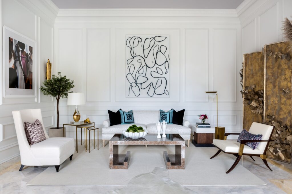
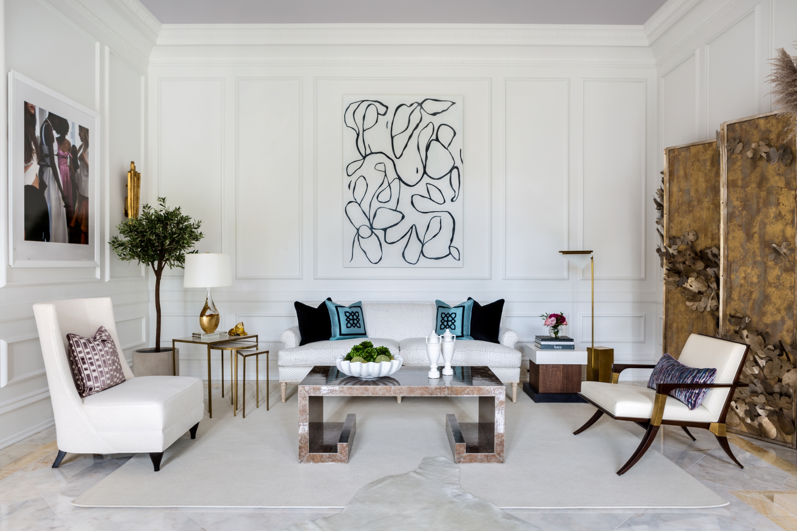
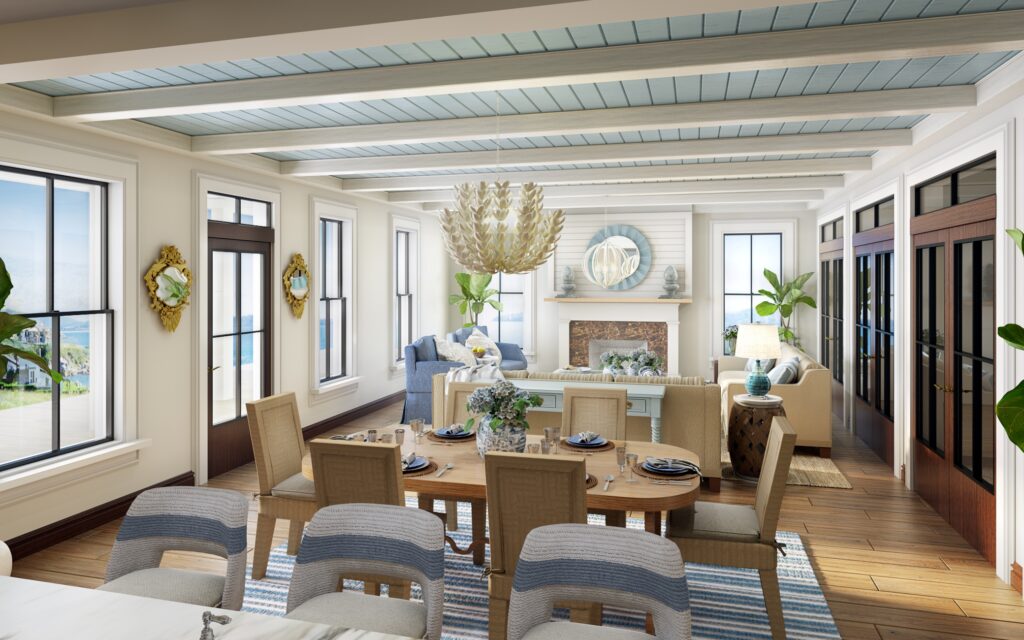
The color white symbolizes purity, peace, lightness, and simplicity which creates a great starting point and is one reason why it is used in design styles such as Scandinavian, Minimalism, and Organic Modern. The color white is also expansive- meaning that using white in spaces makes the room appear bigger.
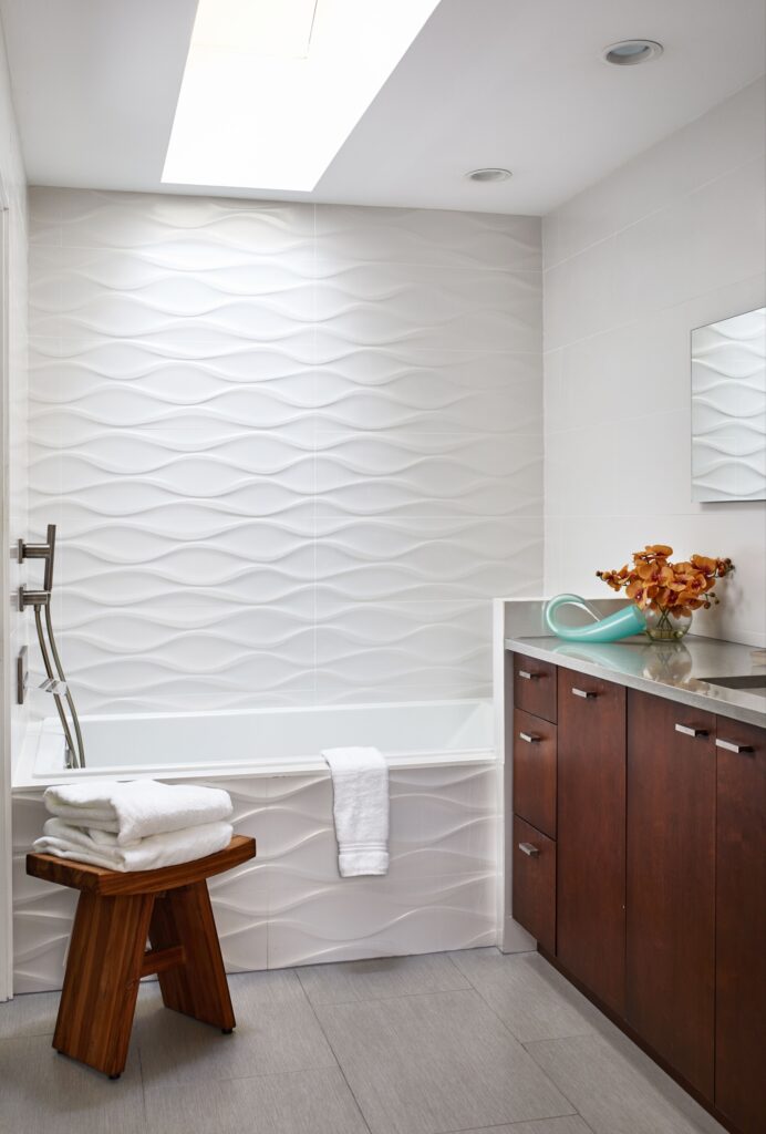
Because white is the absence of color, undertones take on a very important role when it comes to how it impacts our minds. Some people do not like white for their spaces as they find them to feel cold, empty, and sterile like a hospital! A solution to this is if you want to create a warmer environment that feels cozier and more inviting look at whites with warmer undertones. On the other hand, people with more contemporary or modern spaces tend to like cooler whites as they are seen as sleeker and cleaner.
We tend to use white and off-white a lot in our designs. They can be used absolutely anywhere and can accent your spaces beautifully. We have a variety of whites and off-whites that we consider our favorites – it really depends on the client’s preferences and application. Perhaps we will share a list of our favorites in a future blog!
- Neither warm nor cool
- Light
- Purity
- Peace
- Simplicity
- Cleanliness
- Refreshing
- Expansive
- Cold
- Empty
- Sterile
That completes our overview of Color Psychology! Despite writing 3 whole blogs about it, we have barely scraped the surface, so if you find yourself wanting to know more let us know!
Stay Inspired,
The Margery Wedderburn Interiors Team
