
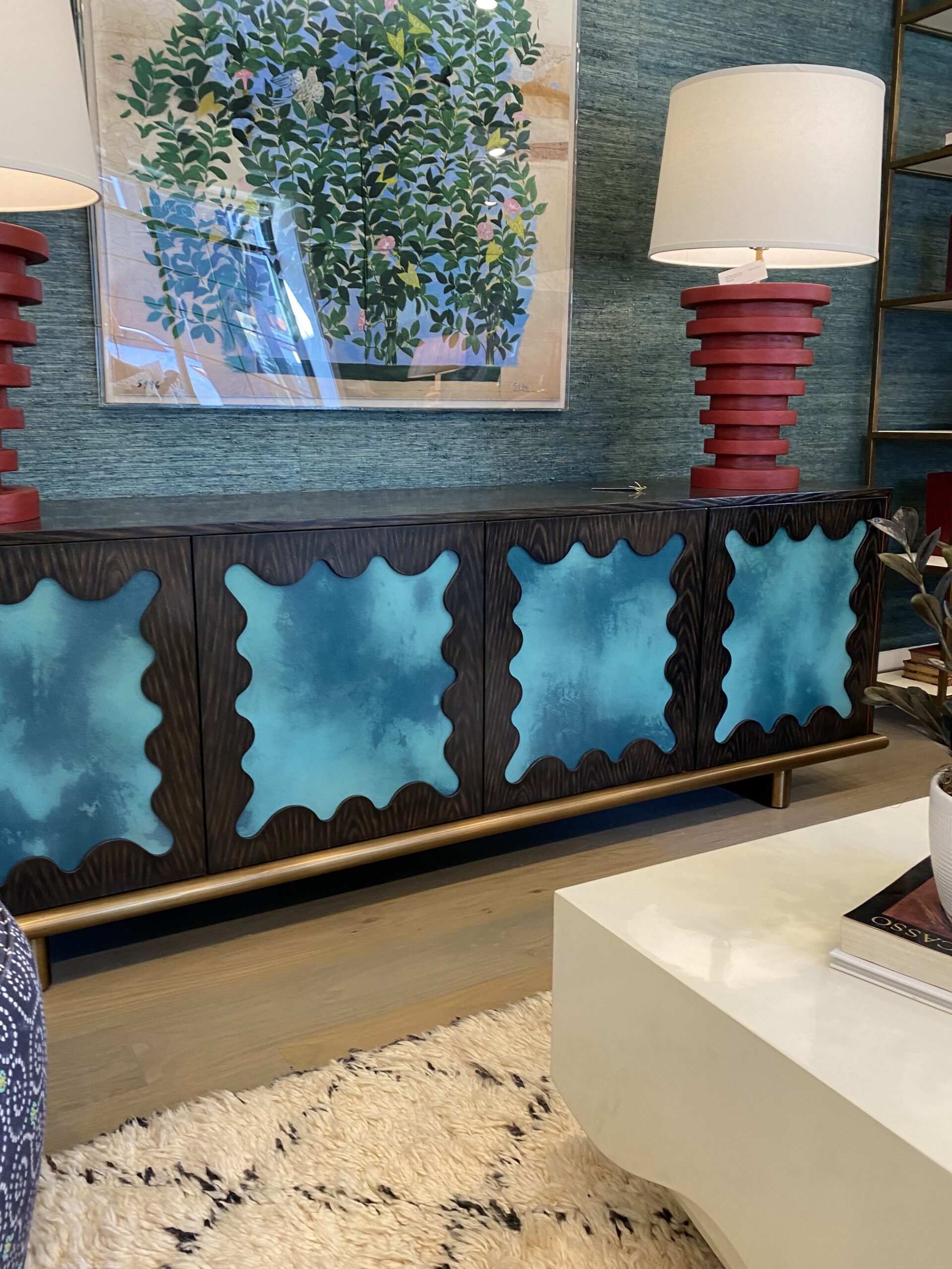
Color(s) of the Year
The Colors of the Year 2024 have already been revealed, and now we’ll share our thoughts on these selections. Benjamin Moore and Sherwin Williams have both chosen shades of blue. Don’t get us wrong – we love blue (it’s one of our favorite go-to colors when designing a space) but blue isn’t a very bold choice in our opinion. A far cry from Pantone’s bright peachy color Peach Fuzz.

This is a pretty blue color with cloudy gray undertones above, but something we’ve seen (and used!) a thousand times. In terms of color this year, we’ll see darker hues, and this one below has a nice violet undertone. However, we would have loved to see purple fully embraced. Why not an eggplant color or a soft lavender shade chosen instead?

Behr went fully dark and moody with their color of the year. A nice charcoal gray with a warmer undertone.

HGTV Home by Sherwin Williams decided to go bold like Pantone with their selection this year. They chose to do a bright, yet soothing, peach color with terracotta undertones.

Trends for Interiors
Color trends are not just the colors themselves. Color trends signify the methods with which to integrate them into a scheme and then find the ambiance you’re looking to create. Here’s how we think color will be used in the upcoming year.
Deep Tones
We are still going to see classic colors used in interiors, but we are expecting color to be used in darker, moodier tones. Dark Browns, Forest Greens, Deep Purples, and Charcoal Grays are just a few colors that we are expecting to see. Using these dark colors helps to create a cozy atmosphere. We like to use deep tones in home offices, libraries, bedrooms, and movie rooms. Using deep mysterious colors makes for a more intimate, cozy space whereas lighter shades are used to make a space feel open and airy.
Warm tones
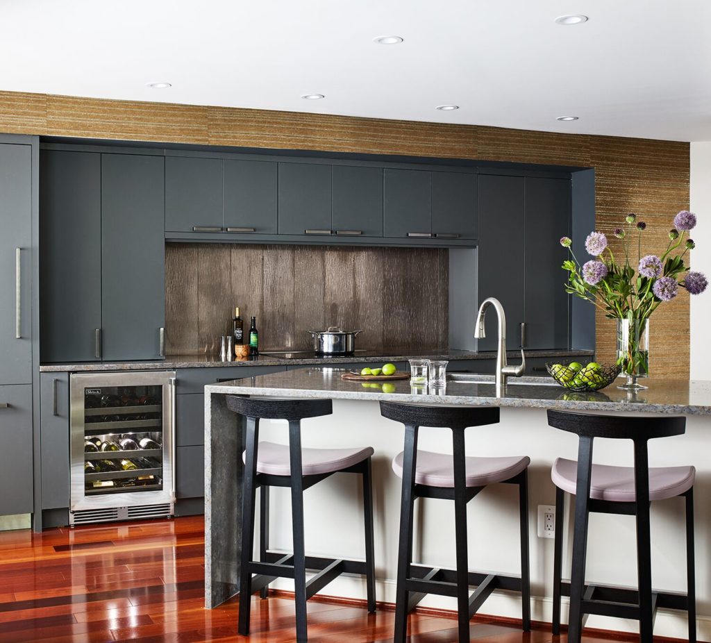
This is something that we have seen coming over the years. For the most part, we are moving away from cool tones (like the dreaded millennial gray). We want to see warmth in our interiors!
Blues
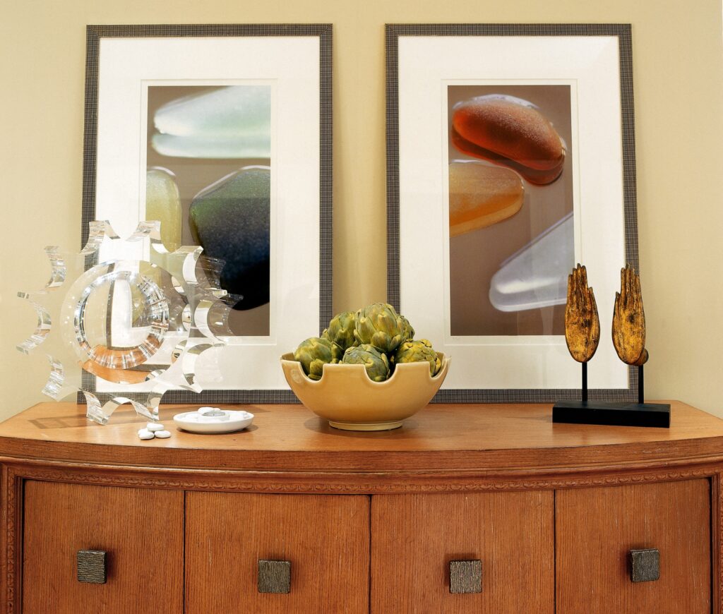
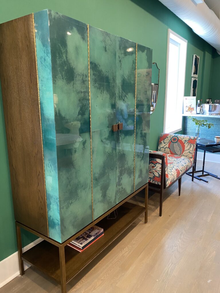
When it comes to interior design, anything blue can be considered a classic, but this year we are expecting a shift in tones with teal and aqua becoming more popular. They are a little bolder, a little brighter, and they add a sense of playfulness to your spaces. During Fall Market 2022, we saw a lot of these teal and aqua tones being used by some vendors such as Julian Chichester, who used these colors on everything from casegoods and upholstery to wallcoverings and paint in their showroom. That was the tip of the iceberg. We’ll continue to see these fabulous color combinations everywhere.
Purple
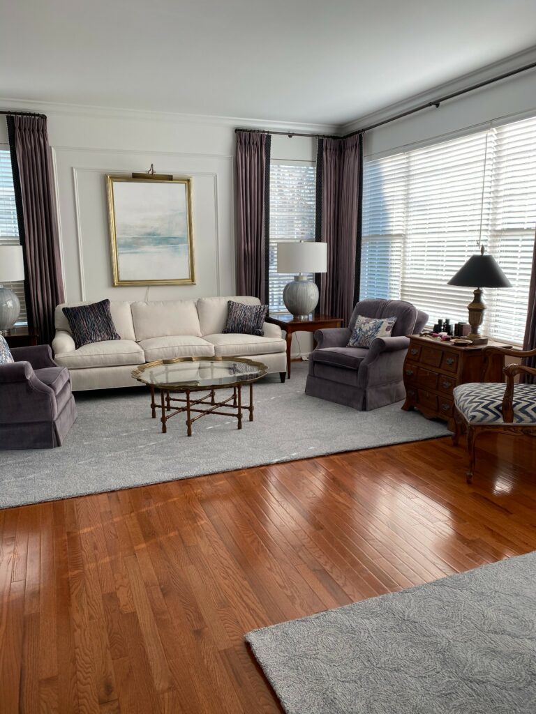
We were hoping to see purple in the mix for color of the year for 2024, but no dice! We are big fans of this versatile color and are looking forward to seeing and using it more (it is more versatile than you would think!) Deep and dark purples are perfect when creating a moody space whereas light and soft purples are a great way to add some elegance.
Green
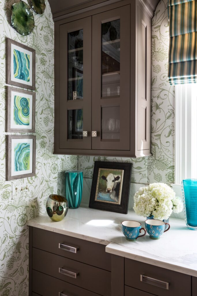
Greens were huge last year and they are not going anywhere! Green has always been a great color to use in interiors as it evokes a feeling of calm and calls to the outdoors. We think there is going to be a lot more green to come, especially in the darker tones.
Brown
We typically use brown tones in our spaces just for accents. Rich, dark brown colors are supposedly on the rise this year. We think we’ll be seeing a lot of dark brown painted cabinets, built-ins, and furniture pieces in the near future. We also see how true browns can make a comeback in fabrics.
We’d love to hear what you think! What colors are you wanting to see used in the upcoming year?
Stay Inspired!
The Margery Wedderburn Interiors Team