
Margery and her family have been going to The Greenbrier Resort in West Virginia for years and we thought it time to share Margery’s experiences! The Greenbrier is known for its iconic interiors designed by Dorothy Draper. Dorothy was the lead designer until the 60’s but her design has only been subtly changed throughout the years, meaning it looks relatively the same. Keep reading to learn more about this renowned destination and our thoughts on the current design.
About the Greenbrier
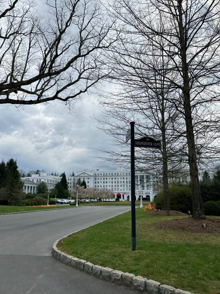
The Greenbrier Resort is a National Historic Landmark and resort in a perfectly idyllic setting in the West Virginia mountains. The resort has been welcoming guests for over 250 years, as it opened in 1778! The Greenbrier is one of the top-rated resorts in the world and is the chosen destination of Royalty, celebrities, and 28 US Presidents.
In its infancy, the resort housed guests that came to the beautiful Allegheny Mountains to visit White Sulphur Springs to get away from the humid southern summers and “restore their health”. It wasn’t until the 1830’s that the resort started to gain its notoriety. The resort played very important roles in both the Civil War and WWII. If you are interested in learning more about that, we recommend you read this history timeline on the resort’s website.
Dorothy Draper- The Icon
Dorothy Draper started her career by redecorating her own homes and eventually branched out to her high society friends’ home as well. She made her big break in the 1930’s and started to make her name in the hotel design industry. She actually had a design advice column that ran in 70 newspapers. Draper was definitely a trend setter, and everyone wanted the Draper look! If you have a red front door, you may have Dorothy Draper to thank.
Draper was credited with creating a new style known as “Modern Baroque” which is a classical style with a dramatic flair. She loved to use crazy vibrant colors and a mix of bold patterns. She also played a lot with scale to elevate the theatrics of her spaces, using oversized accents such as mirrors, lamps and even patterns. Draper was an anti-minimalist which you can surely tell by her designs!
We highly recommend reading this Washington post article which talks more about her influence on the industry.
The “Draperization” of the Greenbrier
Arguably, The Greenbrier is Draper’s most famous work. She was tasked with redesigning the resort in its entirety – not even just interiors, but also small details like staff uniforms, menus, and even matchbooks! She did this all in under a year and a half – an amazing feat for sure as the resort has over 600 guest rooms alone.
Our Thoughts
Dorothy Draper designed for the Greenbrier until the 1960’s when she passed it on to her successor Carleton Varney who worked under her tutelage and worked to continue her style. The Greenbrier is still very much a reflection of Draper’s Modern Baroque style – but how many of her unique touches have been lost over the years?
What we love
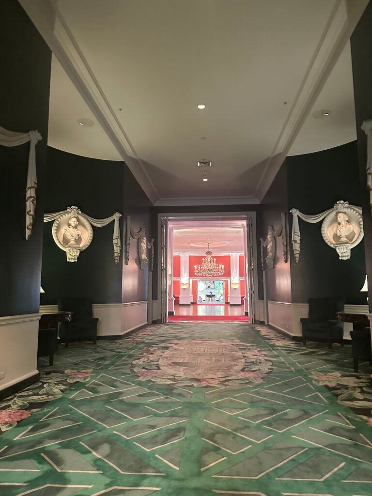
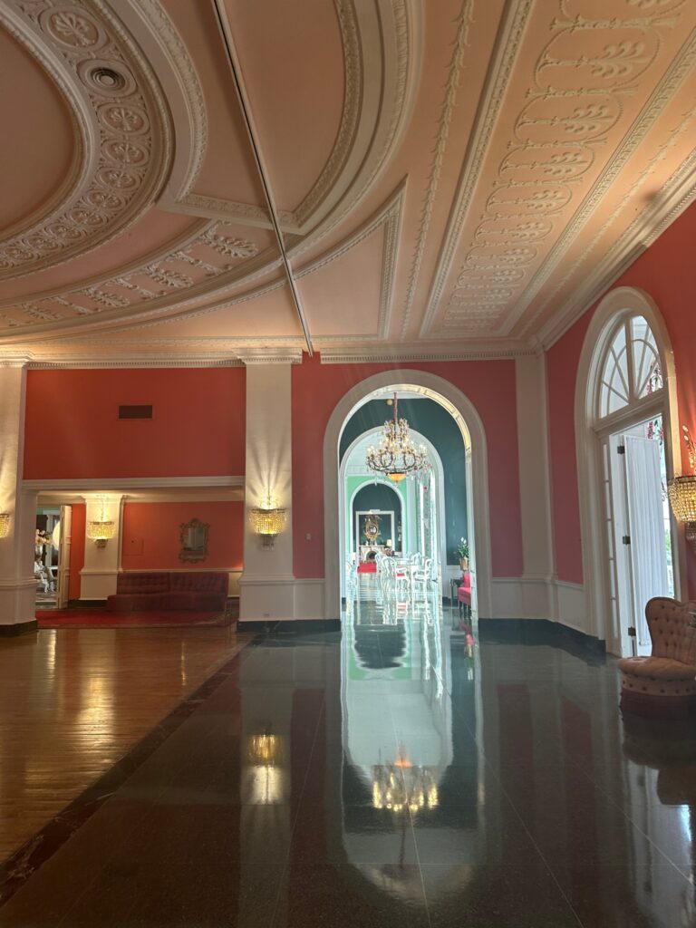
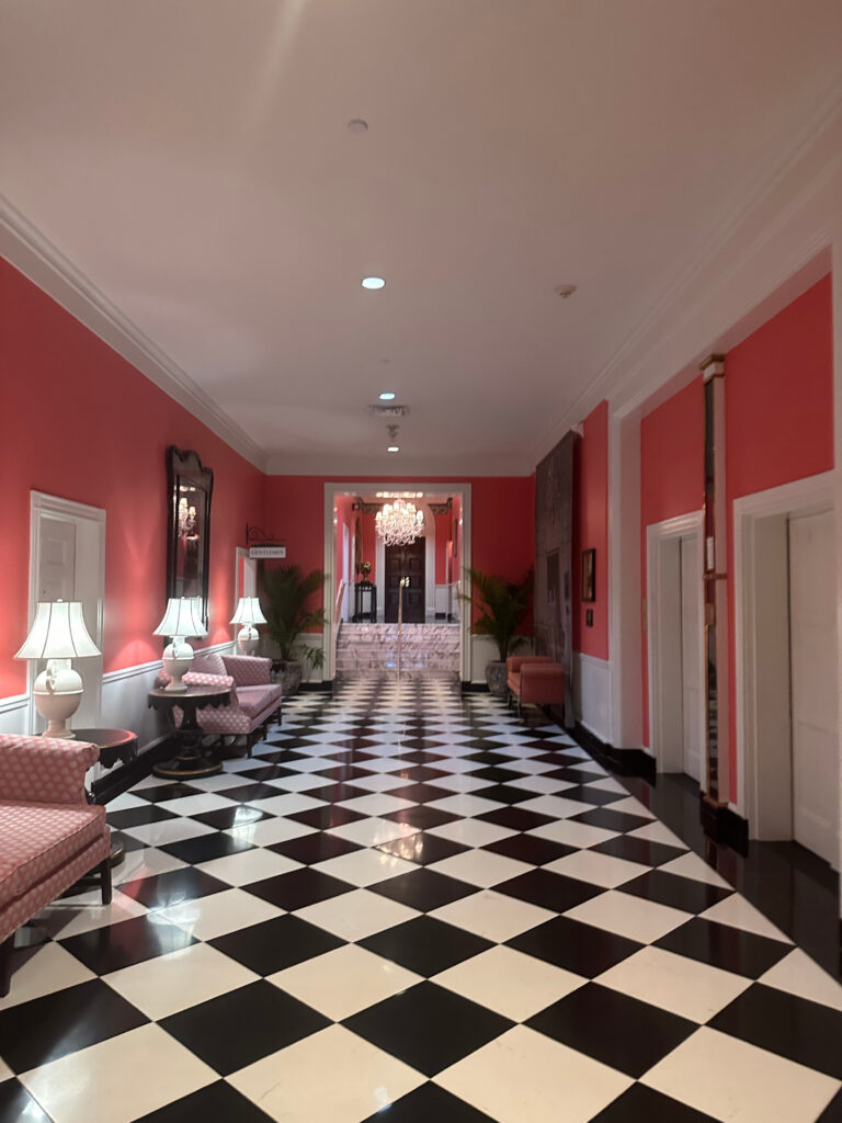
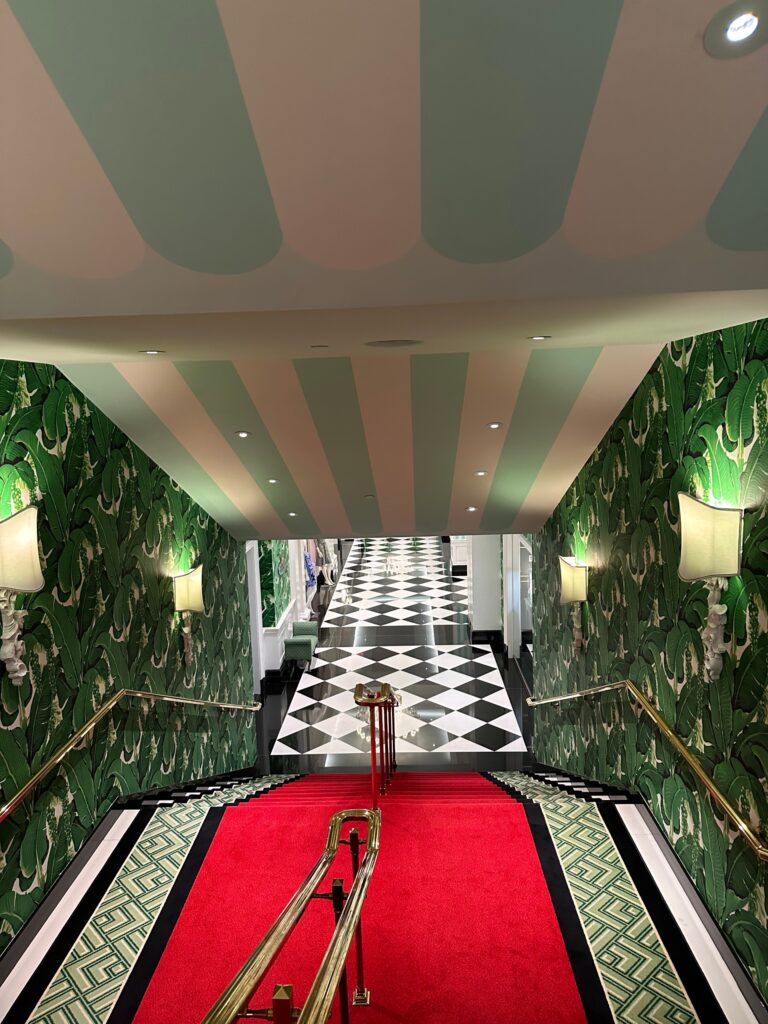
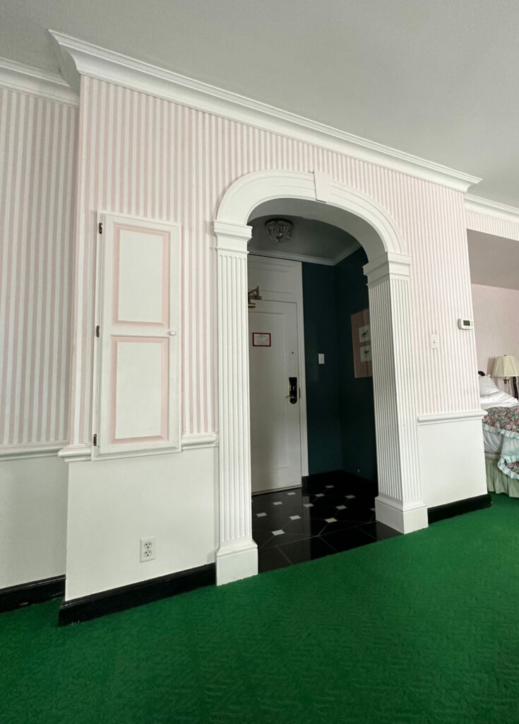
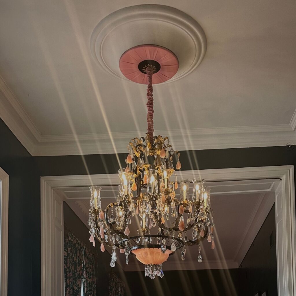
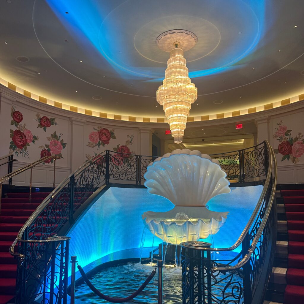
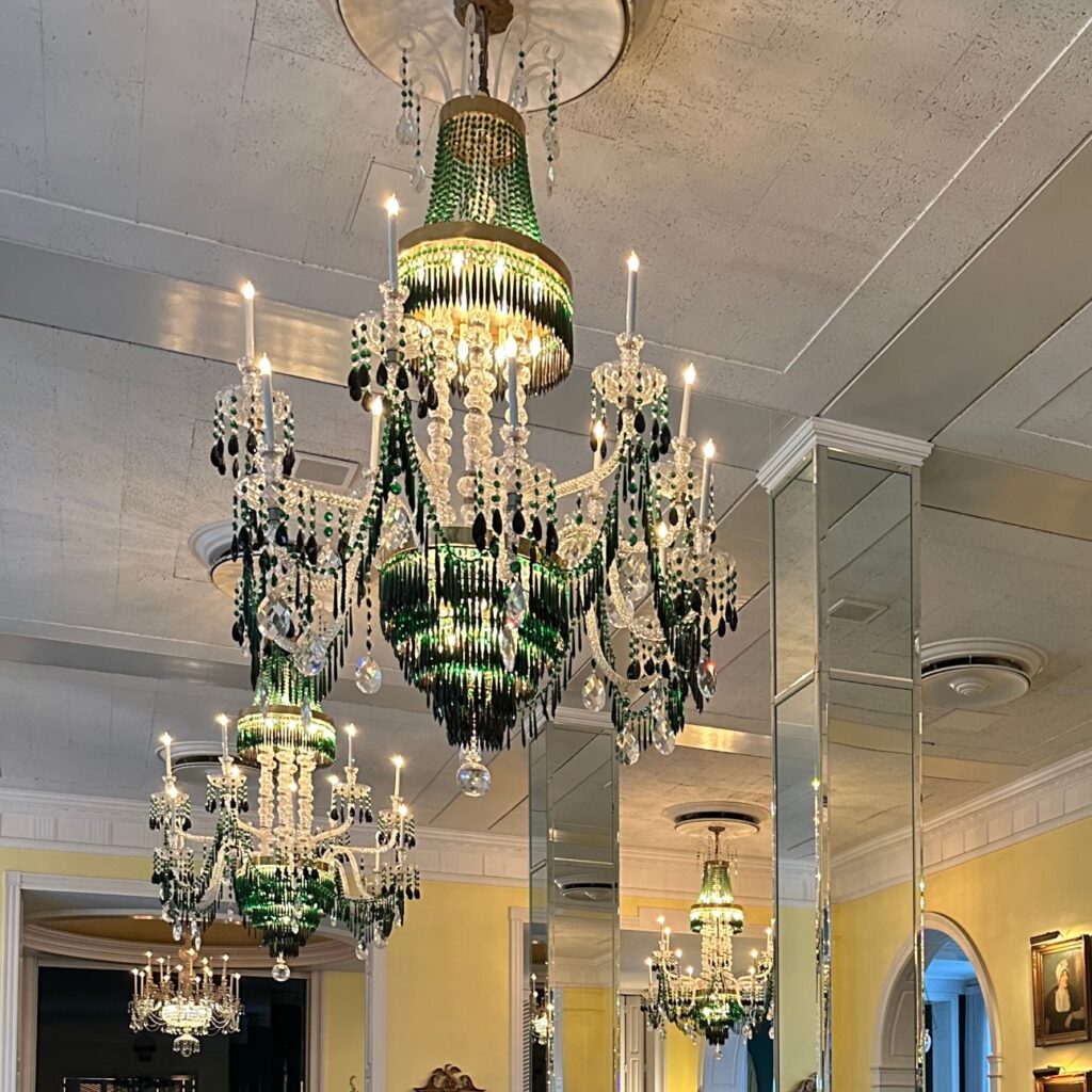
The grand expansive spaces are SO elegant – who doesn’t love tall ceilings with crazy luxurious chandeliers? The trim molding and millwork are also spectacular and such a classic element that elevates every space.
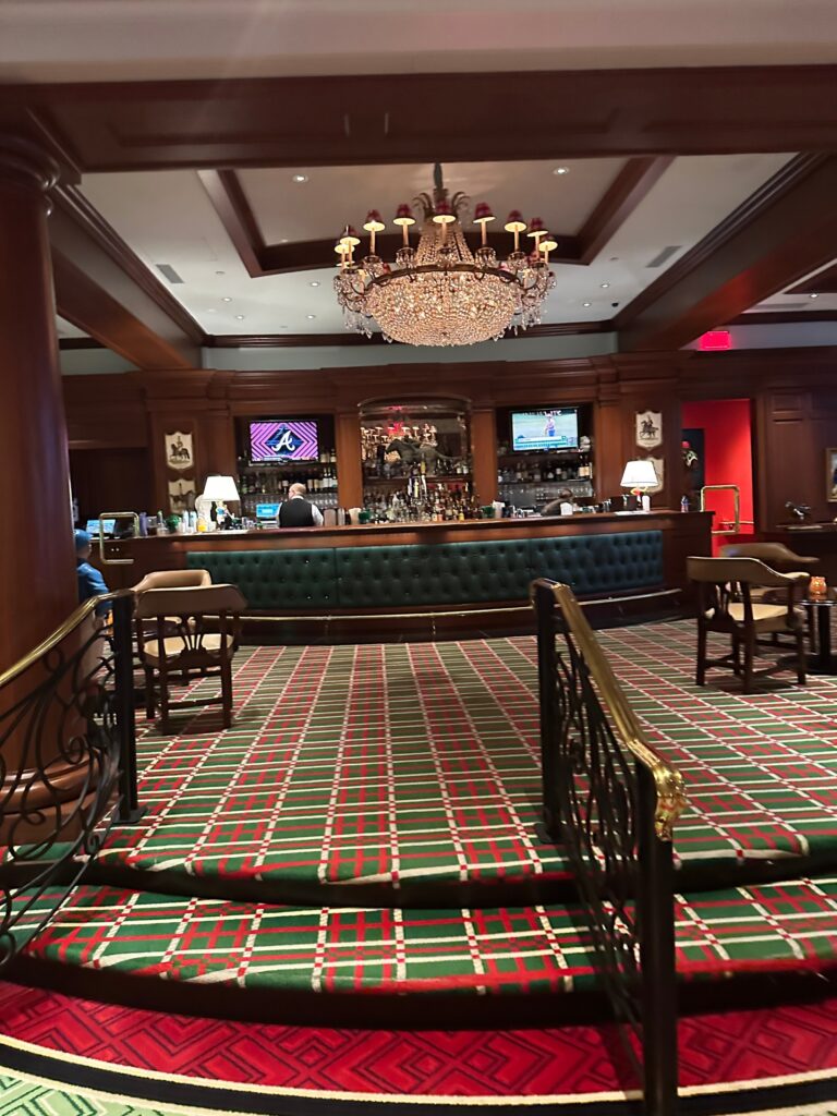
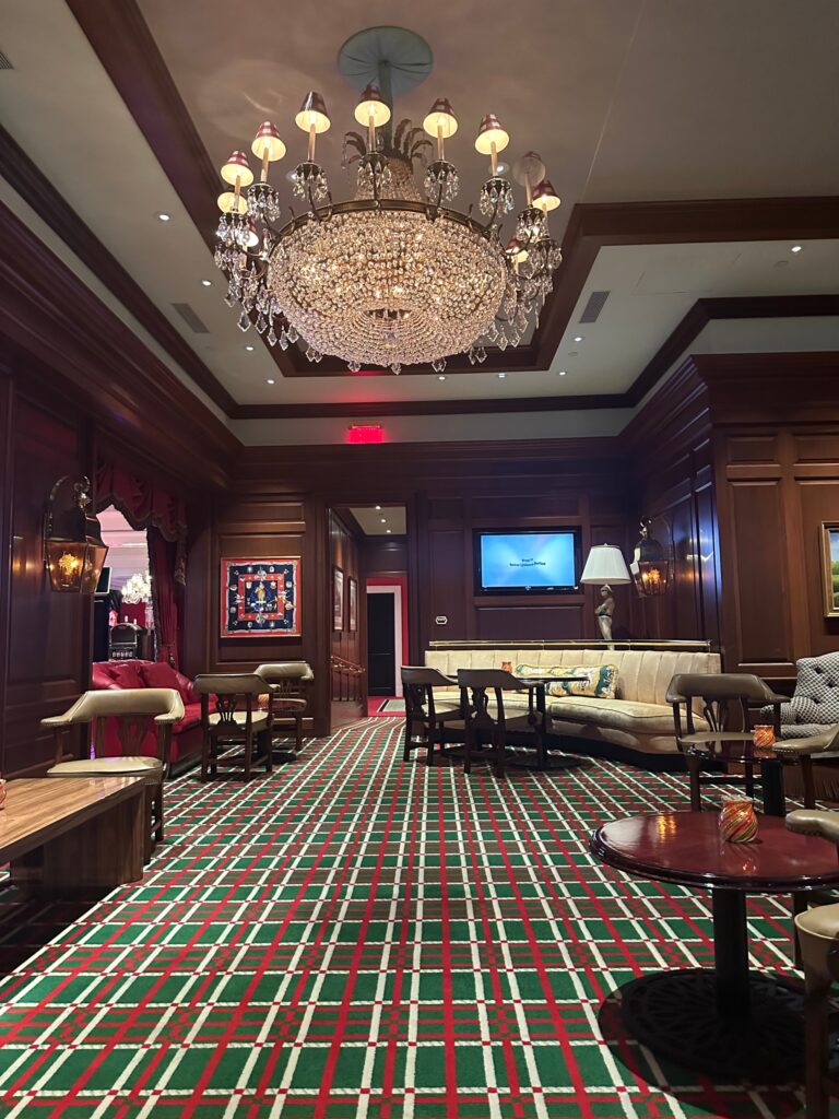
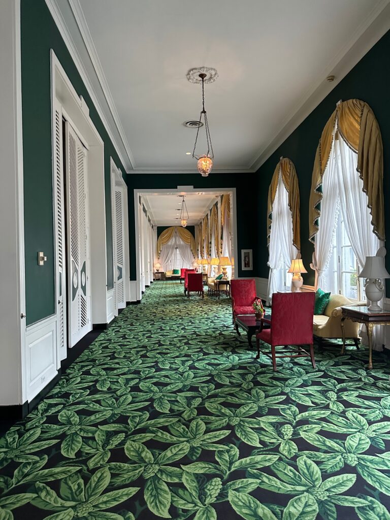
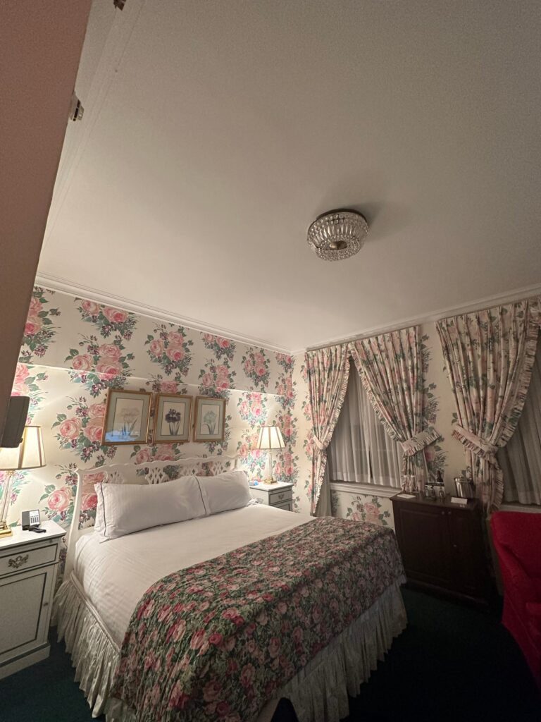
Flooring- the tile flooring looks incredible and such a classic base to any space. We also love the carpet throughout. The carpet selections definitely shows off Draper’s maximalist style!
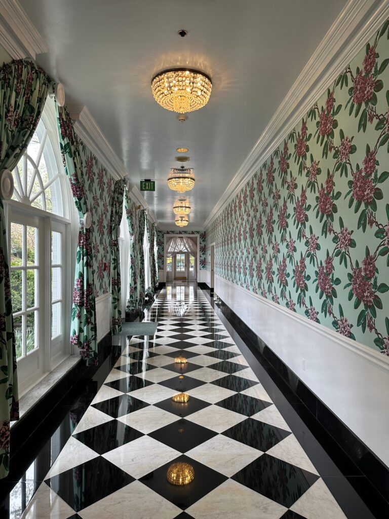
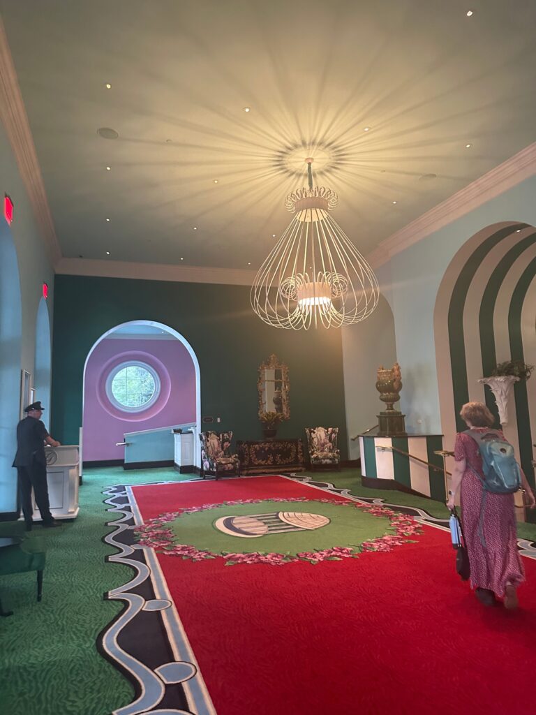
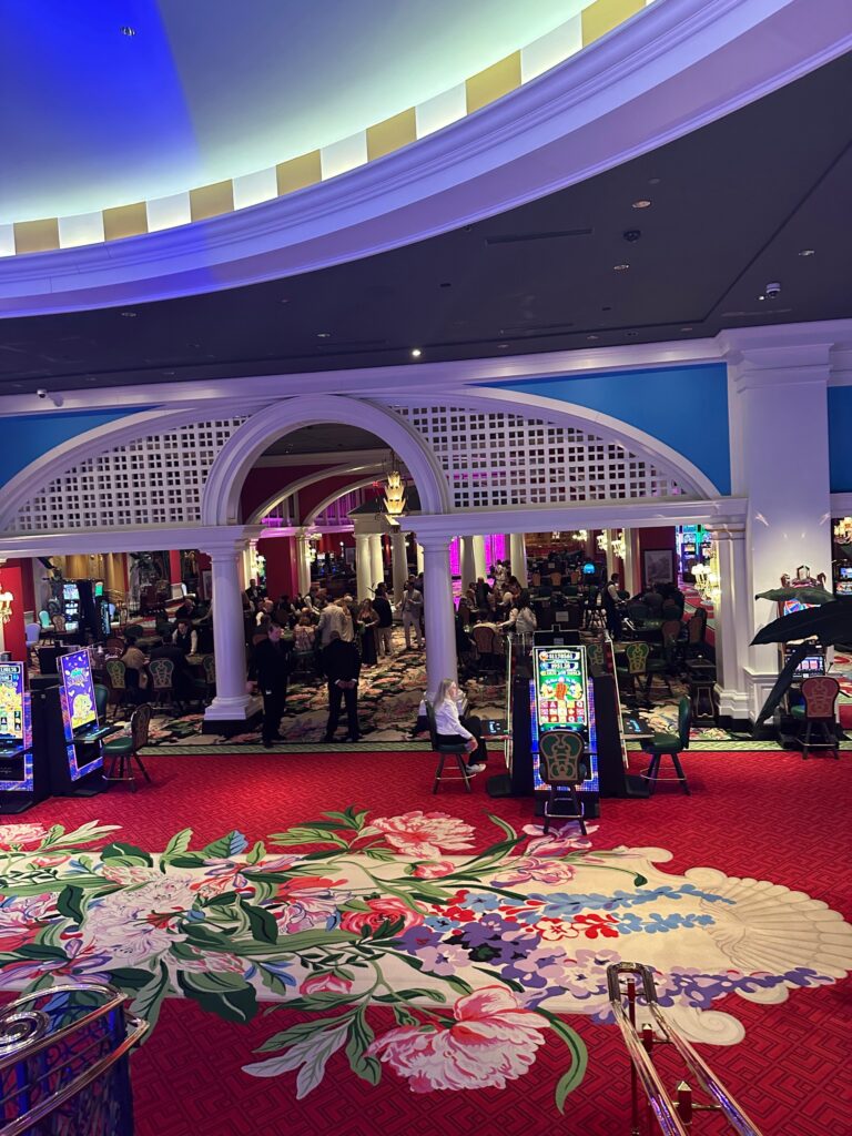
Use of pattern – Draper was never afraid to go bold… and we mean BOLD! The large-scale patterns on the walls, flooring, ceiling, and upholstery are a fundamental part of her style. We love to see it!
Chandeliers- it seemed like every room features the most beautiful chandelier you’ve ever seen – they are THAT stunning. One of our favorite design elements for sure.
Now for the things we were not too fond of:
The cohesiveness of some of the rooms just seems a little bit off. These choices could very well be due to Draper’s eccentric style, but more likely due to the slight updates made throughout the years. We see how it can be very difficult to try and replicate the original selections. Some of the selections seemed close… but not close enough if you get what we mean. Some of the colors and styles clashed – a bit cringeworthy.
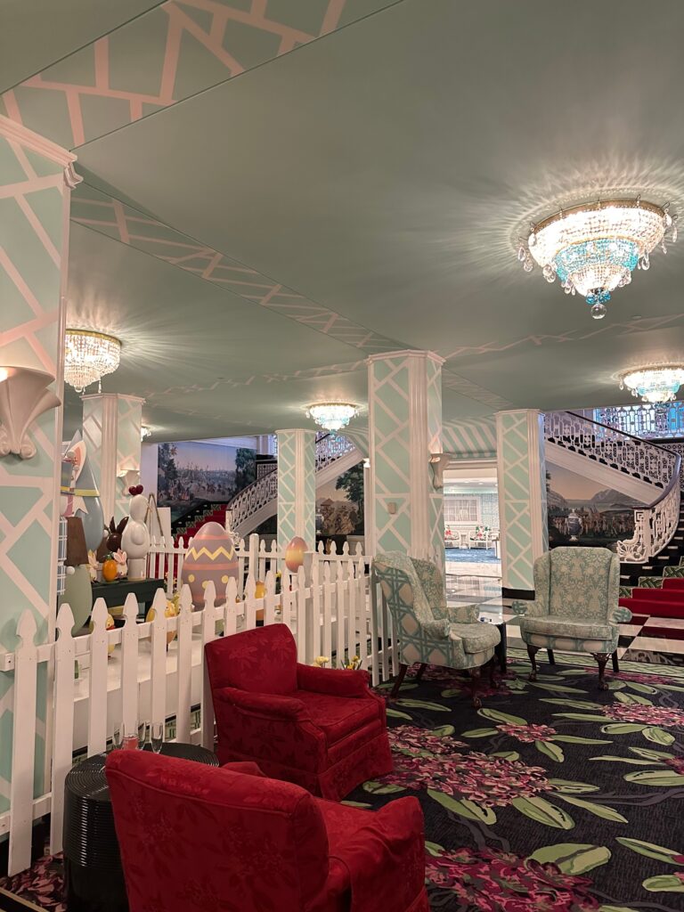
Let’s break down the elements of this space above:
- Easter Decorations- these are cute and festive. Created completely of 100% chocolate – works of art! Certainly not the issue for this space.
- Ceiling and Columns- we like the detailing and color of the ceiling and columns. It ties in well with the blue in the light fixtures. However, does this really go with the elegant stairwell and landscape wallpaper? No.
- Blue chairs- although it is the same color as the ceiling and columns these chairs clash!!! The floral interior fabric is not so bad, but we do not like the trellis pattern on the back at all! It fights so hard against the pattern of the columns! Just remove these all together!
- Red Chairs- by itself these are pretty standard, and we can see what they were trying to do in this space. They help balance the space out by pulling from the red runner on the stairway. This would honestly work better if there weren’t so many other elements to compensate for. Right now, the red is actually helping the space look unbalanced!
- Carpet- by itself we like the carpet a lot. It has a gorgeous floral pattern and some beautiful colors to pull from. It also contrasts nicely with the green border on the stair runner. But why-oh-why is not a single color used elsewhere in this space? The red chairs are close enough… but the tiffany blue? no way.
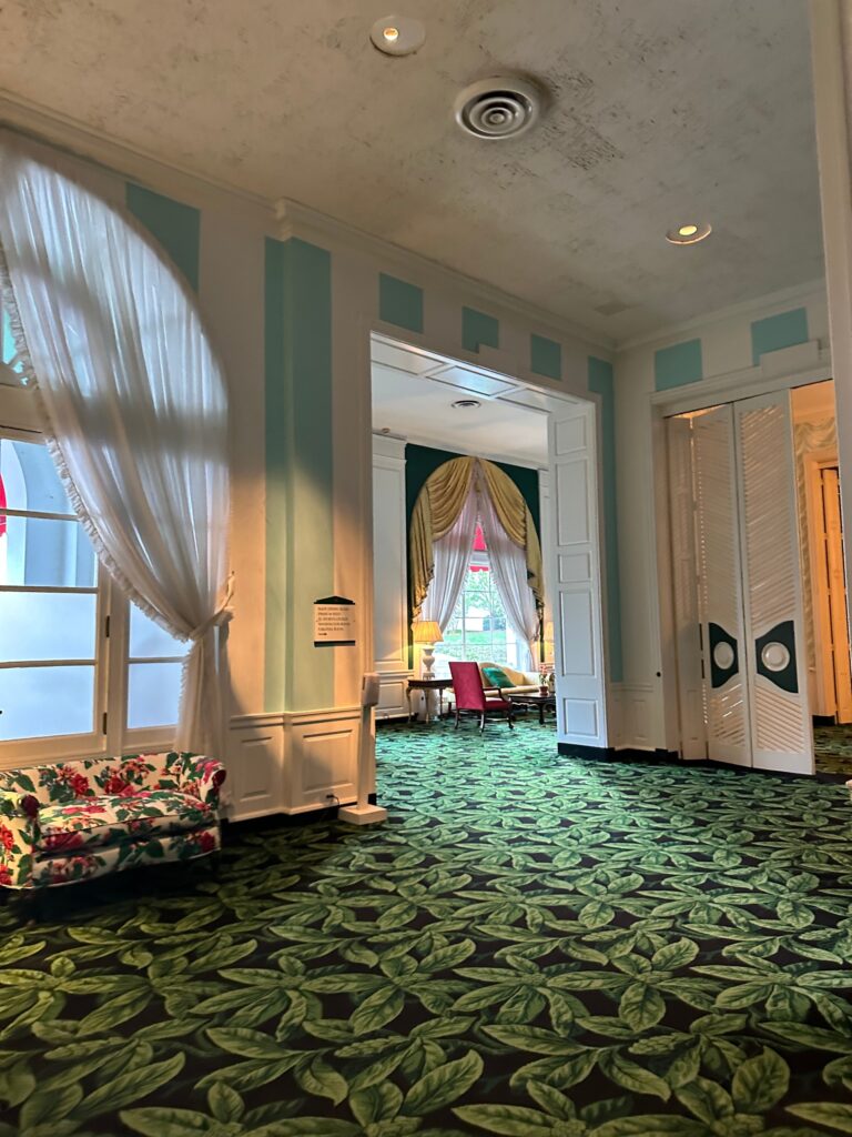
This area above just seems like the back hallway no one cares about. By itself, the bright blue stripes are fun but do not work with the carpet or upholstery at all! The dark green from the hallway beyond would have been a better fit. The upholstery and the carpet we could live with. And what on earth is up with the ceiling?
What do you think of the Greenbrier’s interiors? Do you find it dated or classic?
Stay Inspired,
The Margery Wedderburn Interiors Team
